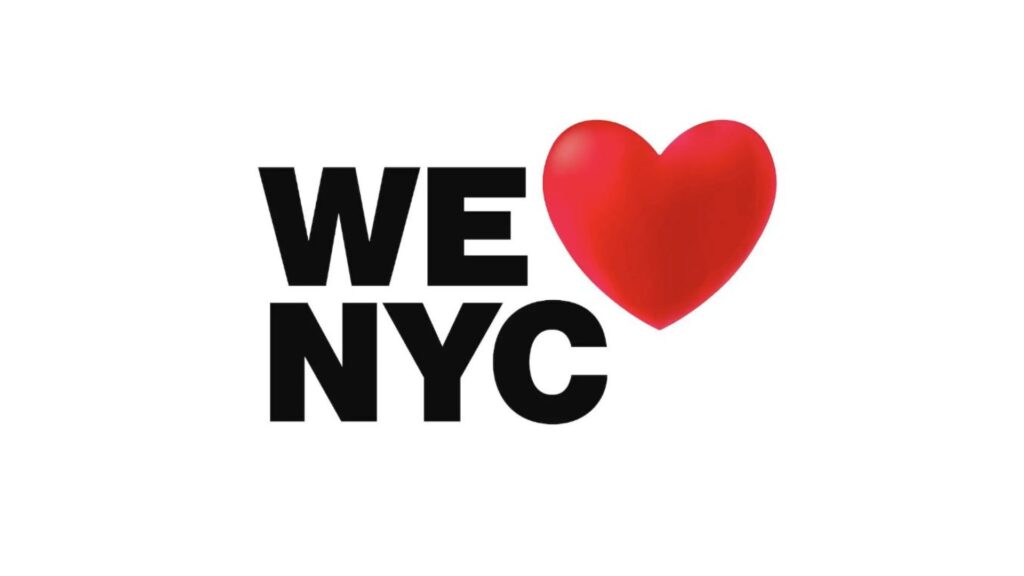
We Love NYC – New York’s new logo
Anyone who has visited New York City or not knows the famous I Love NY, or what is the same, I Love New York. It is common to come across this logo in all kinds of merchandising of the city that we can find in different souvenir shops or in museums.
The truth is that it was in the mid-1970s when New York City was plunged into one of its greatest economic crises. Due to the strong growth of street crime, companies began to leave the city looking for new settlements. All this environment was making the image of New York suffer and tourism was suffering accordingly.
New York City was in need of a strong global push to make it a major financial and tourist center. That is why, in 1977, the New York State Department of Commerce, led by department head William S. Doyle, decided to carry out a project for which it hired the Wells Rich Greene advertising agency with the aim of to develop a marketing campaign. As its designer, the famous Milton Glaser was hired, who had to create the logo that would represent the campaign.
The name of the campaign was already decided, it was “I love New York”. Of course, Milton Glaser was no impromptu. He was co-founder, along with a group of friends, of one of the first design studios in New York. In addition, he was one of the founders of New York magazine, which continues to be so influential today.
At that time Milton Glaser did not make any kind of profit for his work, since the campaign was designed for the public good. What nobody imagined at that time is that this campaign, which was designed to last 3 months, would become a symbol of popular culture and the most famous symbol of New York City.
It was on a taxi ride that inspiration struck Glaser. On a napkin he scribbled just three symbols: the word “I” (“I”), a heart, and the acronym for New York (“NY”). Something simple, but undoubtedly impressive. This sketch made by Glaser is currently in the MoMA in New York although it is not on display.
Something interesting that happened after the attack of September 11, 2001, was when Milton Glaser created a version of the logo called “I love New York More Than Ever”, as a way of showing solidarity with the tragedy that the city had experienced. All the benefits received went to charities who helped to recover the city after the attacks. A detail to consider in the design is the existence of a black spot on the left side of the heart, this is a symbol of the hole left by the Twin Towers in the World Trade Center.
Today, almost 50 years later, the New York authorities decided to replace the old logo through a new campaign that seeks to boost tourism after three complicated years of pandemic.
The new New York logo can read “We Love NYC” instead of “I Love NY”. In both, the characteristic red heart is still visible, but in the new version you can see a subtle 3D effect similar to that of emojis. The new logotype also changes the typeface inspired by the one that appears on the subway signs. With this initiative, the New York authorities have wanted to give a new look to the mythical logo, thus giving rise to a new collective version that replaces the “I” with the “We”. and make it more inclusive and better represent the character of this cosmopolitan city.
The goal of the campaign is to ask everyone who loves the best city in the world to show it by helping and spreading that love to every block in the five boroughs. That is, getting citizens involved in promoting the city. Several artists from the By The Newyork network of independent agencies have created posters depicting what this city means to them. This initiative invites other artists from the city to create their own posters, which will be displayed on the campaign’s official website and on social networks.
New York Mayor Eric Adams spoke about the campaign, assuring that the city has been able to overcome the darkest days of the pandemic thanks to the selfless work of “New Yorkers every day, and that, if each one dedicates at least one hour a week in an act of service, the result will be truly transformative.
We have the unbeatable price of $500 per day for your Billboard:
Option 1: Your 60 second video/photo will be shown, 60 seconds per hour 22 times a day.
Option 2: Your 30 second video/photo will be shown, twice an hour, 44 times a day.
Option 3: Your 15 second video/photo will be shown 4 times per hour 88 times per day.
Please let us know which option you would like to choose. Remember that we have a response time of 72 hours.

